Timeline
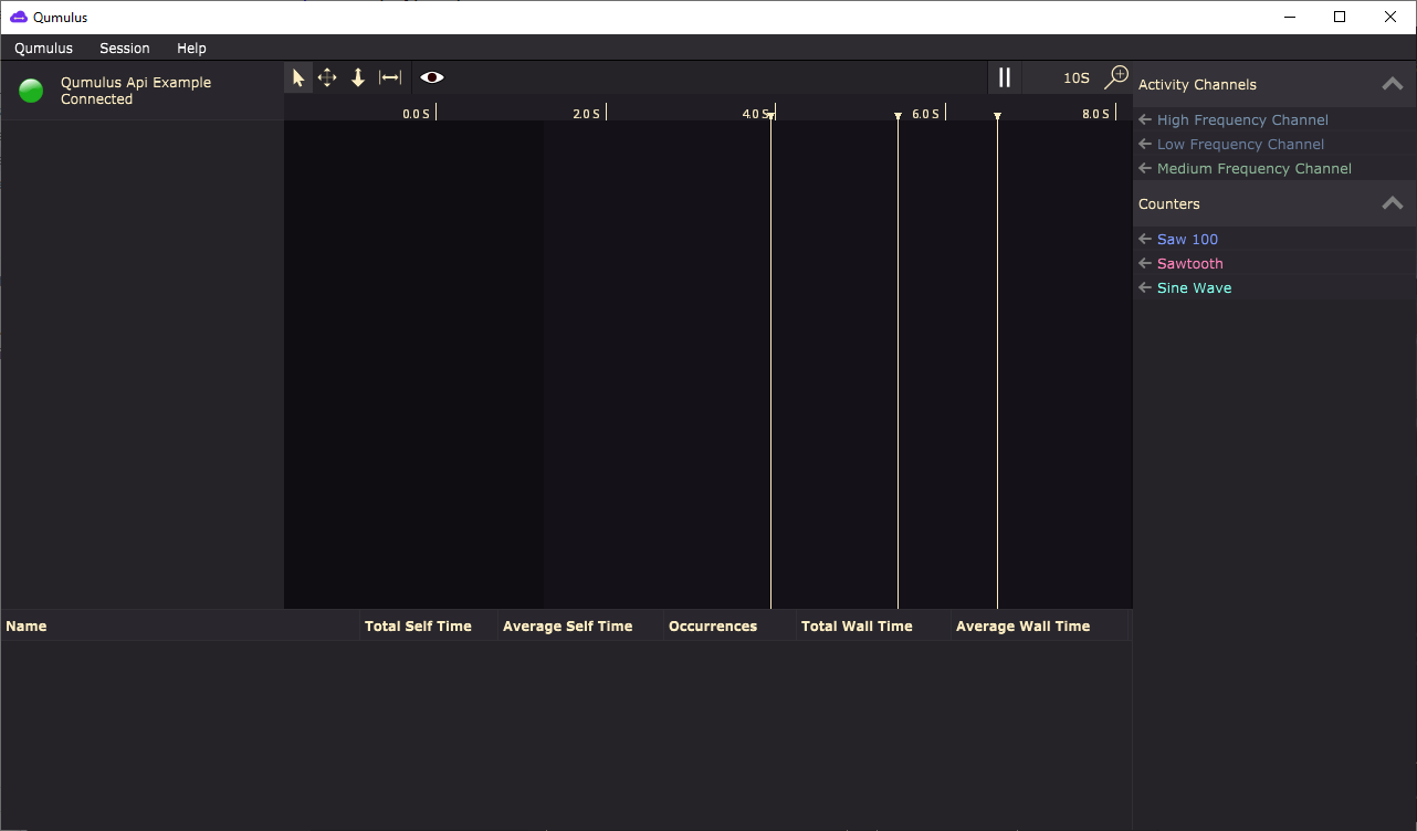
The timeline view is where you can see what is happening when. It maps a global application time on the x axis to activities stacked on top of eachother on the y axis. Initially the timeline is empty as no metrics will have been activated yet. Something like this:

A few things are already visible though. The first thing you can see is that there are a dark and light areas in the timeline. The light area represents the time for which profiling data is available. In this example Qumulus connected to the example when it was running already for about 1.7 seconds and thus any data generated before that time is unavailable.
There are also vertical lines visible, these are called markers. Markers can be used to mark a certain event that you might be interrested in. This could be anything you want, for example a socket disconnect or a file io request. These are shown over all metrics as often they can impact performance on multiple channels.
Finally the right panel contains all available metrics. In order to view their data either click the arrow next to it or drag them to the timeline. You can combine multiple counters into a single metric by dragging one first and then the remaining counters on top of the metric on the left.
Active Metrics
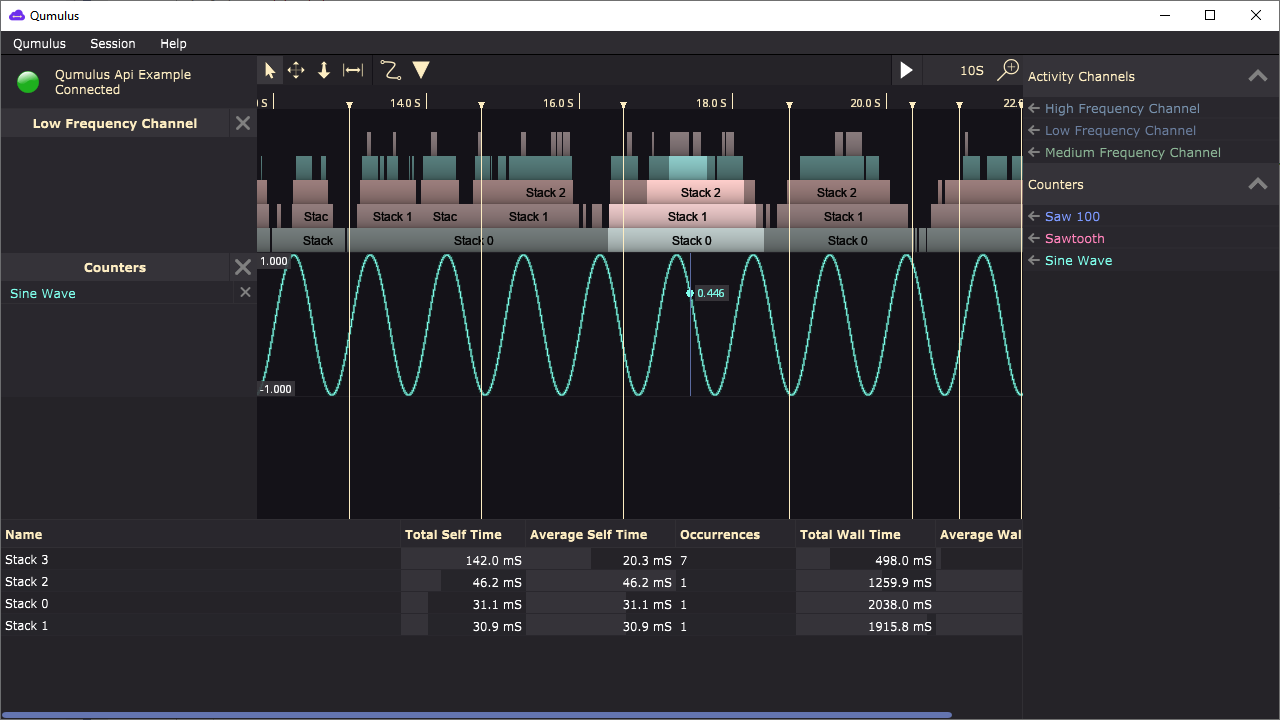
After activating some metrics, pausing the timeline and making a selection it would look something like this:

The active metrics are listed on the left. You can remove them by clicking on the cross next to their name. In the screencapture above there is a metric for an activity channel and one for a counter. The counter if fairly simple to understand. It shows which value the counter had at each respective time. The example uses a sine of the current time to generate this counter’s value so it’s showing a sine wave. When hovering the mouse over the counter’s metric it will highlight the value at that time, in this case the value shown is 0.446.
The activity channel might be a bit different than what you’re used to seeing. This representation is called a flame graph. Each activity is represented by a block and when an activity includes another activity it is stacked on top of it. In code this happens when an instrumented function calls another instrumented function. The parent function will be the bottom activity while the child function will be an activity stacked on top. You can find performance problems by looking at the width of the activities. Wider activities take up a larger amount of time. When you’re repeatedly doing the same thing (ie rendering a frame) you can easilly see exceptions where the frame rendering activity suddenly becomes much wider when the frame takes longer.
Toolbar

This is the toolbar shown in the timeline view. From left to right these are:
Selection arrow. With this tool you can select activities while the timeline is paused. Drag a box over the activities you want to select. You can also inspect counter values. If you hold the cursor over a counter metric while this tool is active it will draw a dot at the counter’s value at that time and add a label with the exact value. You can also pan and zoom using the middle mouse button while this tool is active.
This is the pan tool. When this tool is active you can pan the timeline using the left mouse button. Useful for those mice that only have two buttons.
The zoom tool enables you to zoom using the left mouse button. Click the position where you want to zoom and then drag up and down depending on how much you want to zoom in or out. This tool allows you to zoom in significantly faster than using the scrollwheel so it’s often quite handy when you want to get a really detailled view of what is going on.
This last tool is the measurement tool. When you need to measure time between consecutive activities, or just a long running process you can use this tool. To place the start of the measurement you click and drag it to where you want it to start. The measurement tool snaps to activity edges so when you drag to near an edge you’ll get precicely the time at which an activity started or finished. After starting the measurement with the click-drag-release action you can move the mouse to where you want the measurement to stop. You can just click the mouse to finish the measurement. The measurement tool keeps the boundaries visible as long as the tool is active. This way you can scroll through all your active metrics and see if they show any anomalous behaviour in that region.
Note
You can quickly switch between tools using numbers one through four on your keyboard.
There are also some other utilities provided through the toolbar. The curved path button allows you to show or hide flows while the triangle allows you to do the same for markers. Usually markers are always visible and rendered on top as they may affect more than one metric. If you have a lot of markers however this may get pretty crowded so you can hide them. Flows however are often more plentiful so to prevent them from obscuring the flame graphs these are invisible by default.
On the right side of the toolbar you will find the play/pause button and the zoom preset selector. The play/pause button can be used to make the timeline automatically pan to match the monitored application’s current performance while the zoom presets can be used to reset the zoom level to some presets useful for high/mid/low level inspection.
Selection
The selection panel shows aggregate information for all currently selected activities. It shows averages as well as totals for both Self Time and Wall Time.
Wall Time: This is the total amount of time spent inside an activity including it’s children. So when you have an activity representing a function calling several other instrumented slow functions then the time spent inside those functions is included inside the calling activity’s Wall Time. You usually use this number to find algorithms bottlenecking due to being built up of multiple slow steps.
Self Time: This is the amount of time spent within an activity but excluding it’s children. This results in a number being a pure representation of the amount of work being done within that activity. ie doing lots of slow math or waiting for some asynchronous operation usually shows as large Self Time.
The bars behind each number are a visual representation of that measurement’s impact in relation to the largest impact. So for example when you have selected two activities where one takes twice as long as the other, then the longest activity will have a full bar while the one taking half that amount of time will only have the bar filled up to 50%. You can use this visual aid to quickly find points of interrest, or discard ones that dont contribute anything to the issue you’re investigating.